

The Problem with Most Church Websites
At this point it’s no secret that a website is table-stakes for an organization. We all may have even come around to the fact that the look, feel, and functionality of a site factors into decision-making. Alarmingly, 75% of website users admit to making judgements on an organization’s credibility based on the organization’s website design and content. The reality is that a church website plays an extremely important role in driving members of the local community through your front doors.
This can present an issue for pastors, who sometimes fall into one of two camps:
- Camp 1: “I know I have to have this, but I almost wish we didn’t. I don’t think it’s doing much for us except keeping our congregation up to date (and is it even doing that?).”
- Camp 2: “It could be a lot more than it is today, but I certainly can’t focus on it, and we don’t have volunteers within the church that can either.”
This mentality leads to one common, nearly ubiquitous outcome: church websites are found wanting. They lack focus. They lack direction. They lack efficiency. They lack purpose. Perhaps most of all, they lack attention. This results in a church’s website being one of the most underutilized assets with the most unrealized potential.
However, it’s not for a lack of good intentions, especially from pastors. Pastors are busy pastoring: counseling, preparing for sermons, visiting hospitals, discipling. For those key ministry tasks, most pastors are well-trained. Maximizing the potential of a church’s digital presence? Not so much. Even the pastors who possess gifting to build and manage a website must admit, their time is better invested elsewhere.
Churches genuinely have every intention to seek to reach and bless their communities. But good intentions are not enough. Many times, the best of intentions still results in the worst of pitfalls. This all adds up to create either a strong sense of frustration around what is recognized as a sub-optimal experience, or a feeling of overwhelm at the thought of what it takes to “do it right.” Furthermore, there could even be a notion of hopelessness that an inviting online experience for their church will always be out of reach.
Eight Pitfalls of Most Church Websites
Before pastors can begin to take steps towards a better, more inviting online experience for members of their local community, we must first make sure we have a firm understanding of the issues at hand. So, what are the most common problems of church websites? What are the best fixes for those problems? Give us 7 minutes and we’ll give you the answers, as well as a great way forward.
Most websites fall into one or many of the following traps:
1. Focus Failure: Not Understanding Why the Site Exists
When churches lack specific focus for their site, they try to reach everybody for every purpose. The old marketing mantra of “when you market to everyone, you market to noone” rings true for many church websites. Many churches ask their website, and especially their homepage, to meet the needs of visitors, regular attenders, members, etc. In doing so, they serve none of these audiences effectively. This looks like a site that has poor and overwhelming navigation. It looks like a homepage that has every imaginable piece of information jam-packed into a small piece of web real estate. Ultimately, this results in those considering a visit to your church needing to click through a dense structure with a wide variety of content displayed to find what they want, and none of it framed in a way that drives the visitor to take the next action. What’s more often the result is that they never do find what they want, and give up clicking because they’ve become frustrated.
When you don’t know what you’re aiming at, you’re bound to miss it. When you don’t know why your site exists, you’re bound to miss your main audience. The right purpose will bring all elements of your site into focus.
2. Structure Failure: Basic Information is Difficult to Find
As a result of Failure #1, content won’t be strategically placed because you’re not certain who you’re placing it for, and there isn’t clarity on the most important information that particular target audience needs. Basic information such as Sunday service times, the feel of your Sunday service, and a simple welcome for first time visitors can be difficult to find. Perhaps that information is buried on subpages. Perhaps it’s only in small print in a margin or in the footer of your site. Many churches, though they may display a “Visit Us” link front and center, are not thinking through what other complimentary pieces of information someone needs to make a decision.
You don’t want a site where people have to hunt. If getting basic information is a challenge, people typically will not press through to find it. They’ll bounce off your site and you’ll miss the opportunity you had to reach them. A well-structured site will know who it’s being built for and where key information needs to go.
3. Content Failure: Outdated Content Remains on the Site
When our website lacks focus and structure, it becomes unruly to manage. The result is content failure. Your Christmas Eve service is still on the site in February. The men’s conference you had in May is still open for registration in June. VBS is still being advertised…but it’s October!
Pastors don’t have adequate time to devote to keeping a site updated and current. Nor can they spare the mental capacity to focus their minds on them. Futile attempts at trying harder will eventually fail. There’s a better way that will bring lasting results.
4. Design Failure: Uninspiring Design is Light on Photography
We’ve addressed the challenges that come with structure failure and content failure. There’s a related category that causes many readers to click away from your site, without them even knowing why: design failure. Design is certainly subjective, but church websites must tap into the universal human desire to be a part of something great. Visitors may not know specifically what they’re looking for on your site, but they do want to feel good about the place they’re potentially going to visit. They want to feel inspired and confident in taking the next step.
Because many church sites are under-developed and done cheaply, the general look of the site tends to cause visitors to lose interest quickly. Colors and features are boring. Pictures are awkwardly placed. The site looks wonky on a phone. Stock photography is overused, causing the site to look like it was imported from outside the community. The church is a place of vibrant life, but that is often lost in the failure of design.
5. Authenticity Failure: Over promising on What Cannot Be Delivered
To conquer the boredom dragon, some churches will over promise. Picture a Christmas concert with lights, full band, and stage smoke hovering throughout the room. Then picture a 30-seond clip of that on the homepage.
That’s what visitors will expect to see on Sundays. Yet, when Sunday comes and they chose to visit, they see a guitar, keyboard, and small drum set lit with pale overhead lighting. The problem isn’t the size of the band or nature of the lights. The problem is that you’ve overpromised on what you actually delivered. People don’t like the switch. They’d rather you be straight with them from the start.
6. First-Impression Failure: Giving Requests are Prominently Displayed
With the promise of effective online giving, many pastors will post their giving option prominently on their homepage. Pop-ups are even used to give folks a chance to give. As helpful as this may seem for your long-time members, this is the wrong first impression to give to a visitor, leading to first-impression failure.
It is crucial to ask the following question: when someone visits your site for the first time, what impression will they have about your church? Will they be able to tell what’s most important to you? Will they see what you’re about? If a giving pop-up is the first thing they see, the answer to those questions is likely “no.”
7. Responsive-Design Failure: Website is not Mobile Friendly
In recent years, many out of the box church website templates promise automatic conversion of your site from desktop view to mobile view. At that, many pastors think their bases are covered. The unfortunate result is a website that is not necessarily mobile friendly.
Users are turning to their mobile devices more and more these days, and their interactions on mobile differ from interactions on desktop. Users prefer short, simple interactions with tappable features, modified navigations, content re-prioritization, and integration with other features on the phone. This means that church website designs need to adapt to a mobile-first reality in ways that go beyond shrinking content down to a smaller screen size.
8. The Eighth Pitfall of the Troubled-Website World – The Pastor
Pastors are wonderful gifts to the local church for a myriad of reasons. With all they carry, however, some items simply aren’t a priority. Church websites are one of them.
In our experience, most pastors are unaware of the problems built into the fabric of their websites and therefore fail to realize the opportunity that is being missed. They either don’t appreciate the value of a well-built site or they can’t afford the time or capacity to commit to it. This results in a number of common relationship problems between pastor and site:
- Unfamiliarity – Pastors often don’t know where to find things on their own sites. So, when they’re talking with people on a Sunday, they are unable to direct them accurately. Even from the pulpit, some pastors ask the congregation, “What’s our website’s address again?”
- Distraction – With the many pastoral responsibilities filling calendars, many pastors conclude they have more important matters to take care of. So the site feels like a distraction from mission as opposed to a means for mission to occur.
- Obligation – This relationship problem reveals the pastor never really bought into the need for the site in the first place. They were told by enough people that a site was needed, so they acquiesced.
- Surrender – This poor pastor sees the problem; truly he does. He knows it’s bad. However, he doesn’t know what to do to fix it. Add to that the daunting task of finding the time to make it work properly, and the pastor waves the white flag in surrender.
Even if your website passes many of the relationship pitfalls mentioned above, it likely still has a fundamental flaw. It is trying to do too much for too many audiences. With the best of efforts, it succeeds at serving none of them. There’s a better way!
It’s Time to Rethink Church Websites – We need to rethink everything we believe we know about church websites and start from the ground up. We need to rethink the purpose. We need to rethink the audience. We need to rethink the management of our sites. It’s time for us to level the building, clear the rubble, and build from the ground up. With a fresh perspective, you’ll find church websites can be effective, efficient, and affordable.
Three Building Blocks for a New Kind of Church Website
With the rubble cleared out of the way, we’re ready to build a healthy perspective on what a church website is for, who it’s for, and how it’s structured.
Building Block #1: Focused Purpose
This answers the important question: why do we have a website? We tend to think of our site as serving those who come to our church. It provides a central location for church events, registrations, and announcements. With that assumption, however, we forget that people will search for churches. When they do, our site is what they will find. They arrive and find a site targeting people who are already there. It’s not for them, so they move on. This ought not be.
A properly focused website has the visitor and community in view. It is designed to be found by strangers, by people that church members have never met, and to give the visitor what he or she needs. A properly focused website seeks to be discovered by the community, to make a good first impression, and to inspire people to visit the church in person.
- Get Discovered by your Community – Each church should be aiming for those who live within a 5-8 mile radius around the church. What matters to them? Where do they spend their time and money? What are their kids doing after school? One easy way to do this is through digital outreach advertising + SEO (search engine optimization). Every click on the website should be designed with those people in view.
- Make a Good First Impression – The entire design and layout should be filtered through the idea of first impressions. Is there anything here that would create a bad impression? Is our homepage culturally tone deaf? Does it look disorganized? Have we made important items easy to find? The solution to these problems is in the quality of the web design, compelling local photography, and effective organization.
- Inspire People to Visit – The message found on your homepage will help determine whether they click in for more info. Does the content seek to do too much? Is there enough to whet their appetites? Have you overwhelmed them with content? The solution to these challenges is a consistently compelling message, with each page providing action steps for them to take.
Building Block #2: Community & Audience Understanding
Until you understand your local community, you will be unable to succeed at being discovered, making a good impression, or inspiring your digital visitors. Why? Because it is in understanding your community where you find the information that guides what you aim, why you aim, and how you aim. Knowing the proper audience of your website allows you to craft messaging that speaks to those you’re trying to reach.
Personas provide an invaluable tool when seeking to learn about your community. Personas are a few targeted profiles that capture the main audiences in your community. Every church should have 2-3 personas carefully and thoroughly developed. They will provide direction for more than your website. They will provide direction for outreach, for invites, for the types of community events you host, etc.
Here is a sample persona to give you a flavor:
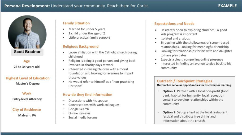
For a thorough treatment of personas, including how to develop one and why they’re so important check our our article on personas here.
Building Block #3: Streamlined Architecture
Historically, a church website has been trying to meet the needs of two different kinds of people within a single framework: new people checking out the church, and members/regular attenders. These are two separate audiences with very distinct “goals” (the task a user is trying to accomplish – i.e. finding directions versus signing up to serve) they are using the website to achieve. Rather than thinking about the diversity of content needs, and the most appropriate way to organize and display that content as to provide as seamless of an experience as possible for the user, often times we simply try to make sure absolutely everything is available to everyone. This creates an experience where information for a new visitor is jumbled with important information for a regular attender, and so both are not served as effectively as possible. The home page becomes a requisite smorgasbord of information that users must wade through.
What’s required is the creation of a slim, clean, well-designed, engaging website aimed only at visitors, and then to provide a single, separate online hub aimed at your members. This chart plainly lays out the complexity of the old way of thinking, juxtaposed with the simplicity of the new way.
OLD WAY
- Homepage
- Who We Are / Mission
- What We Believe
- Leadership Team
- Get Involved
- Sermons
- Contact
- Calendar / Events
- Give
- Prayer Request
- Sunday Livestream
- Ministry Teams
- Request Counseling Appointment
- Baptism Request
- Explore Membership
- Small Groups
- Baptism Request
NEW WAY
Visitor Website
Your primary domain
(yourchurch.org)
- Homepage
- Who We Are
- What We Believe
- Leadership Team
- Ministries
- Sermons
- Visit on Sunday
Church Center
Secondary domain
(yourchurch.org/hub)
- Calendar / Events
- Give
- Sermons
- Prayer Request
- Contact
- Livestream
- Ministry Teams
- Counseling
- Baptism Request
- Membership
- Small Groups
Under this streamlined architecture, a visitor encounters only the information he or she needs to make a decision. In a digital world where the impression of your church is impacted in seconds, creating a tightly-focused site catering directly to this audience’s needs is essential. At the same time, your online platform now allows the members of your church a central hub to get important information, tithe, sign up for events, listen to sermons, and get further connected.
Your Next Step
It’s now time to review your own site through the lens of the building blocks above. Does it have a focused purpose? Is that purpose abundantly clear to someone who isn’t familiar with your church? Next, does it communicate and speak in a way that resonates with your local community? Would people within a 5-8 mile radius of your church find themselves connecting to your messaging? And finally, does the architecture (navigation, amount of pages, etc.) then provide a smooth, easy, seamless experience that delivers on your purpose?
It could be helpful to send this article to other members of your leadership team and discuss this all together. This could also seem to be a daunting task! We’re here to help. If you’re interested in walking through this exercise for your church, feel free to schedule a no-risk, completely free consultation call with Digital Outreach.